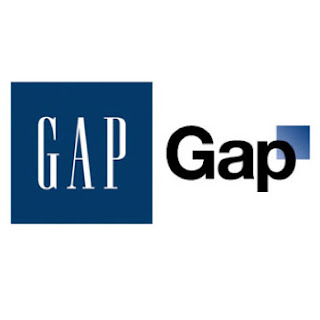
Gap Logo “Fiasco”
I’m not sure this whole incident with the Gap logo was really an attempt to change their identity, or simply refresh their logo. I believe it was a desperate attempt to save the company. First off all, the research I did gave no evidence of printing their new logo on anything; I think it was just a change of a file on the website. If there is a lesson to be learned, it’s that changing such a well established logo should be done with caution, but I’m not so sure this is a severe as it might appear. As for the new logo, I think I like it better than the original, It just received so much criticism because the original logo had become so well established and defined.
My research gave no indication that their print media had been affected yet. They were probably just trying it out on the website first to gauge the public reaction. If they were fully committed to the new logo, there would have been reprints of their logo on everything, and it would have been released at the same time. It would also have been very likely that they would have announced the change before hand, if they were serious about changing it and forming a new identity for the company. I believe it was their full intent to encourage a public response, though maybe they wished it had been a little subtler.
As I mentioned above, if there is a lesson to be learned, it would be to take great care and caution when changing logos, or design schemes for a company that has established its brand on a large scale. My first reaction to the news of the massive public outcry was that they severely damaged their brand and their company with this attempt to refresh it, but after reading a little more into the “fiasco,” I gained a new perspective. I had already assumed that this was a desperate attempt to recover their fading company, but what I hadn’t thought of before, was that maybe this was a success. Maybe they wanted this fiasco for the publicity. I remember hearing somewhere, “Bad publicity is better than no publicity.” This could have been, all along, just a publicity stunt. Further evidence to this conclusion is their “attempt to recover.” After the public outrage, they replaced the new logo with the old, and put up a contest on Facebook for the public to design logos, of which the best, or most popular would be chosen. They could benefit quite nicely with this event, with a new logo, new customers, and a significant increase in sales.
As for the logo itself, I liked the new change better than the original. The original was established, but not really much of a design, and they’re in a good place for a change right now. It took popular concepts and adapted it to fit their name. I like the new sans serif font better than the old. The old font was dated and fading in popularity. Sans serif fonts are very popular right now, and I totally agree with their choice in font. The title caps are great, and very popular. It defiantly appears less formal that the call caps serif of the first logo. This might make their product seem cheaper, in both quality and price, which may be one of the reasons people didn’t like this logo.The white-ish background is another good choice, as it is very popular (see apple).The square is fine; I do like the gradient and the placement. There is nothing wrong with this logo, in fact, it is generally quite appealing, but it conveys a completely different message than the original. The original says high class, but affordable. It could also symbolize products, in this case, clothes that are very conservative.The new logo makes the company appear much more informal, and the potential for a larger product line, as the word “Gap” is only partially inside a box and the majority of the word extends away from the box. It is more appealing to lower income groups, as it really doesn’t define which class it is designed for.
All of these are signs that the company is broadening its target audience in an attempt to increase its customer base. I can see how its current customer base could be upset, but I think, in their current state, it is more beneficial to try to draw in more demographics. The retaining of the square in the new design was put there strategically in an attempt to retain its current customer base. This could be a major problem for the company, but if it is a publicity stunt, it could be genius, and could save a company that is fading away.


No comments:
Post a Comment