Thursday, December 16, 2010

Final Project

My final project was to design the graphics that goes into the production end of game development. Basically a game case cover, game booklet, and game disc. The target audience is Xbox 360 gamers, and that's only for the cover, which is all you can see on the self at a store. The main call to action is to buy this game, and of course, play it. My Idea for the final project comes from my original publication ad idea, so I took my main idea from publication thumbnails. 

Specifications and Pricing

Game Case Cover
Trim Size: 10.5” x 7.375”
Bleed Size: .125”
Margin: .125”
File format: PDF
Color Mode: CMYK
Folds: 2 folds .25” from center of document

Game Booklet
Trim Size: 9” x 7”
Bleed: .125
Margin: .125
File Format PDF
Color Mode: CMYK
Pages: 8-page booklet (2 sheets)
Folds: fold in middle
Binding: staple

Game Disc
Printed on DVD disc
Live Area: 4.75” x 5.75” (circle)
Margin: .125”
File Format: JPEG
Color Mode: CMYK

Total Price Quote
500 copies of each: $1,750
(includes all sheet prints, DVD printing, and game box.)

Thumbnails
 

Rough sketches

Final Product
Game Case Cover


Game Booklet


Game Disc


Saturday, December 4, 2010

Publication Ad Assignment

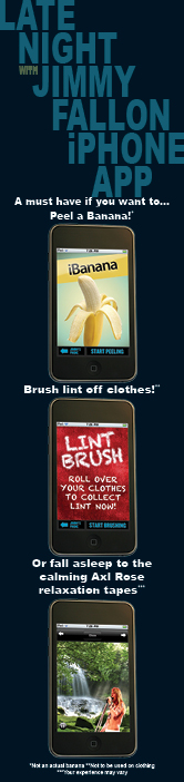
For this assignment, the challenge was to create two ads for a full color publication. One had to be a full page and the other a partial page. I had some trouble determining the topic of this ad until I was inspired by Jimmy Fallon's release of the Late Night with Jimmy Fallon iPhone App. I immediately saw the potential of a publication ad. I wanted to use their design themes from the show, website, and the app itself to create the ad. I found a similar font, used their approximate colors, and did my best to stay true to the style of the show. The colors are matches of the web colors, so I was curious as to how they would print.

Thumbnails
 Roughs

 Final Product

1/3 Page
Trim size: 2.31" x 9.75"
Live Area: 2.06" x 9.5" 
Bleed: none
 

Full Page
Trim size: 8.375" x 10.875"
Live Area: 7.875" x 10.375"
Bleed: .25"


Monday, November 15, 2010

VML Presentation on the Impact of Emerging Media

At the Four State Regional Technology Conference I managed to see several presentations, but the VML showcase about the Impact of Emerging Media, presented by Joe Grigsby, was particularly insightful. Grigsby defined emerging media as the “consumer behavior trends that transform how they connect to content, to each other, and to the broader society.” He divided this into two basic categories: social and mobile.

He started off with some pretty impressive stats for social media. As of this year, two thirds of all media is digital, and 76% of all broadband users are active contributors to social media. Facebook alone has over 500 million active users. Grigsby stated, “If Facebook was a country, it would be the 3rd largest,” larger than America. He also mentioned that Facebook is overtaking Google as the “starting point” for the Internet. After learning these statistics, it is pretty obvious that social media as a profound effect on consumer behavior. Consumers participate in discussions about a product or a brand within social networking whether a company participates or not. These discussions are often more powerful than marketing acts because consumers trust other consumers twice as much.

If marketing is reach and influence, then social media has the reach, and friends have the influence. The greatest value that marketing can have is where business goals and consumer goals overlap. Social media has the capacity for listening, sharing, participation, awareness, and community. Having something of value to say can get people talking and listening. It is important to have good community management by talking about topics unrelated to products and direct advertising, talking about the idea or lifestyle associated with the business, and be prepared for good and bad feedback. Integration is important too.  “Any one thing by itself will fail. He recommended linking your business website to Facebook, twitter, and other social media outlets, and share information from the website on as many sites as possible. A business should encourage activation through paid media campaigns, event invitations, on site activities, influencer outreach, social media promotions, content, and search optimization. A good example would be Facebook ads, where you can target a very specific demographic with information highly customized for them. Finally, measure social participation and track the success of your objectives.

The second category is mobile, which is no surprise with every company trying to make money releasing an iPhone app.  This mass market value is growing dramatically with the expansion of increased network speeds, flat rate data plans, and device capabilities. In 2011 there will be more smart phones on the market than feature phones. About 30% of Facebook activity takes place on mobile Internet. When using mobile media for marketing, it becomes very important to understand your target audience. Know what devices are used, and how they are used. Design something that the people will want to use. Text messaging can be used for alerts, event notifications, special offers, sweepstakes, voting, and surveys.

The general goal of using these forms emerging media is to connect and activate your audience and connect the physical marketing to digital.  Going into this I was well aware of how these emerging technologies could be used, but the presentation really put the true power of social and mobile media into perspective.

Friday, November 12, 2010

News Paper Ad

Project Specifications

Target Audience:
  • Low/Mid-level income groups
  • People lacking health insurance
  • more open minded audience
  • Any age group, generally adults
Call to Action:
Visit the website (www.8gateshealth.com)

Budget: $100

Three Ads in Series

Ad
Size
Cost (page area x $4)
1
1(1.83) x 2
$8
2.
1(1.83) x 5
$20
3.
3(5.75) x 6
$72

Production Schedule:
October 7th: Begin project and form plan
October 12th: Determine campaign, budget, and ad sizes
October 16th: Complete thumbnail and rough sketches and begin work on digital files
October 19th: First ad digital file complete
October 23rd: Second ad digital file complete
October 26th: Third ad digital file complete
October 28th: Project Deadline

Project Synopsis
My goal for this project was to inform people of the services provided by 8 Gates Natural Health LLC by drawing as many people to the website as possible. I targeted the demographics listed above, but I also left the ads vague and mysterious and kept my design clean and contemporary in order to welcome any audience. I did this too attempt to bring in a larger customer base. Many people are skeptical about natural/Chinese medicine and acupuncture, and if I can get them to a website, I can get them to all the information, where the audience can decide for themselves. I used the 8 Gates logo, or a variation of the logo in all of the ads to form some brand recognition through the repetition of the ads.  The ads are designed to run in a series.

The First Ad


The first ad is an attention getter. It has a lot of white space, high contrast and a big visual statement. It is my intention, with this ad, to introduce the business and connect people to the website, where more information can be found. I added the 8 Gates logo, but kept it small to emphasize the large ad and the powerful symbol in order draw as much attention as possible.

The Second Ad

The second ad is still a smaller ad, but still uses and emphasis on white space to get a readers attention. I presented a new message and a simpler design with just text and the logo. I'm trying to inform readers a little bit, but still trying to draw people to the website for more information.

The Third Ad

The third ad is the coupon ad. It provides information on current deals and offers, but still links to the website where a reader can find the address and more information. I used a variation of the logo to serve as a border around the text, and used the web address to complete the border on the bottom to give it a fully boxed in feel. I also put an emphasis on the 10% off to immediately get a reader's attention to the offer.

Overall I am very happy with the results and I will probably put them in to use for 8 Gates Natural Health in Kansas City, which is a real business my sister started over 6 months ago and I have been doing all the design work for her including the website and business cards.

Copyright Statement
All materials and designs used in this project are original material designed solely by Kevin Chrisjohn and are the property of Kevin Chrisjohn and 8 Gates Natural Health LLC.

Sunday, October 31, 2010

Brendan Murphy

On October 15th, Brendan Murphy, a PSU alumni and senior partner for Lippincott, came back to Pitt State for a symposium. I was unable to make it to the symposium, but I’m sure it was very insightful and inspiring.

He originally came to Pitt State on a track scholarship and had taken commercial graphics as a safety net. I can kind of relate because, although commercial graphics is my primary career pursuit, I also plan on pursuing musical composition. Why not both? He also went on to say “when you’re trying to get established in your career, the craft that you learn is essential,” and mentioned that after your first year, your degree doesn’t really matter that much. Which to me, means that you have to know what your doing. Your work speaks louder than your resume. I really hope this is the case, not because I have a bad resume, I’m sure I have a good enough resume, but because I want the opportunity to let my work speak for itself. I want to be hired based on my abilities, not because of the school I went to or my past work experience. I also hope that is the case when I look for composition work, because I won’t have much of a resume for that, but I can still have a great portfolio based on my own work.

He also emphasized the importance of technical writing, saying, “Although my job is as a designer, I spend 75% of my time writing and about 5 to 10% drawing.” I can defiantly believe it, and it is good to know I’ll be making use of all this experience I’m getting with all these writing to learn classes that I can’t seem to avoid taking. He also went on to say “What Pittsburg gave me was an appreciation for typography.” I’ve defiantly learned to appreciate typography, though I wish I could take a typography class. From what I understand Pitt State used to have one a few years back, but I guess it got remove due to lack of interest. I think there is interest now…

I do find it pretty cool that he redesigned the handicapped symbol. It takes guts to redesign a symbol so well established as that one. If you think about, it is very similar to what Gap tried to do, and we all know how well that worked out for them. His redesign was received well, however, and you know he did good when a company as big and widespread as Wal-Mart adopted the design and stands at the forefront of a new idea.

He concludes with three main points. First he reminds us that technology is always changing and that we should work on our design skills and ideas, not just technological skills. I believe his exact words were, “Never fall in love with technology, because technology will change.” Well, I do love my tech, but I also love change and advancement in technology, because with every major upgrade in hardware, or new version of the Creative Suite, by design process is less hindered by the technology I need to complete my work. His second point is, “Problem solving is sort of an art. A bad consultant will give you answers. A good one will raise questions.” I suppose what he means is that a consultant should ask the client the questions that will lead them to their own solutions and ideas that they really want.
For his final point he says, “Any time there is change, you’re going to get opposition.” 
…How true is that.

Monday, October 18, 2010

Recruitment Notepad

Word Matrix


Thumbnail sketches

Rough sketch

Proof

     The assignment was to design a notepad to be given away to high school students interested in Pittstate’s GIT program. The only required specifications of the project were that it use only black ink, have 50 sheets perfect bound with chipboard backing, and it had to be designed to reach the high school demographic as an audience. After analyzing the target audience, I developed thumbnails and roughs that lead me to the design I chose.

     I thought about my experiences as a high school student, formulated a word matrix, and tried empathized with the current high school demographic. One category found in my word matrix that I could relate and empathize with was entertainment. This is a broad category that included games, movies, books, music, and commercials. I didn’t want the notepad to appear like it was specifically targeting high school students because most perspective GIT students who would see this are looking to the future beyond high school. I wanted to take a more subtle approach, so I looked at common themes and trends in entertainment that most high school students enjoyed. Several video games and movies lately have been about concepts of the future and technological advancement. Among these, some of the most popular are actually set in the past, or set in the style of the past, often to an early industrial era, or in the 1940s-60s, when the art deco was a popular architecture style. Industrial/ functional design is also a popular theme in media. I realize that I may have dug a little deep for my theme, but I think its potential is best proved in the popularity of games such as Bioshock, Fallout, and Halo and movies such as Avatar, The Dark Knight, Sherlock Holmes, and TV shows like Lost. 

     I combined the Art Deco and industrial themes and worked with it for a while until I came up with the design I created. I modeled it off of the Bioshock logo, which is a very popular game franchise currently building hype on their next release. Then I incorporated a modified version of the Kansas Tech Center aperture logo to my image for emphasis and to help create a focal point. Finally I added an industrial, riveted footer to tie the piece together and create unity and balance. I believe this design will reach many high school student demographics, especially gamers and many students interested in our GIT program.

Thursday, October 14, 2010


Gap Logo “Fiasco”
       I’m not sure this whole incident with the Gap logo was really an attempt to change their identity, or simply refresh their logo. I believe it was a desperate attempt to save the company. First off all, the research I did gave no evidence of printing their new logo on anything; I think it was just a change of a file on the website. If there is a lesson to be learned, it’s that changing such a well established logo should be done with caution, but I’m not so sure this is a severe as it might appear. As for the new logo, I think I like it better than the original, It just received so much criticism because the original logo had become so well established and defined.

     My research gave no indication that their print media had been affected yet. They were probably just trying it out on the website first to gauge the public reaction. If they were fully committed to the new logo, there would have been reprints of their logo on everything, and it would have been released at the same time. It would also have been very likely that they would have announced the change before hand, if they were serious about changing it and forming a new identity for the company. I believe it was their full intent to encourage a public response, though maybe they wished it had been a little subtler.

      As I mentioned above, if there is a lesson to be learned, it would be to take great care and caution when changing logos, or design schemes for a company that has established its brand on a large scale. My first reaction to the news of the massive public outcry was that they severely damaged their brand and their company with this attempt to refresh it, but after reading a little more into the “fiasco,” I gained a new perspective. I had already assumed that this was a desperate attempt to recover their fading company, but what I hadn’t thought of before, was that maybe this was a success. Maybe they wanted this fiasco for the publicity. I remember hearing somewhere, “Bad publicity is better than no publicity.” This could have been, all along, just a publicity stunt. Further evidence to this conclusion is their “attempt to recover.” After the public outrage, they replaced the new logo with the old, and put up a contest on Facebook for the public to design logos, of which the best, or most popular would be chosen. They could benefit quite nicely with this event, with a new logo, new customers, and a significant increase in sales. 

     As for the logo itself, I liked the new change better than the original. The original was established, but not really much of a design, and they’re in a good place for a change right now. It took popular concepts and adapted it to fit their name. I like the new sans serif font better than the old. The old font was dated and fading in popularity. Sans serif fonts are very popular right now, and I totally agree with their choice in font. The title caps are great, and very popular. It defiantly appears less formal that the call caps serif of the first logo. This might make their product seem cheaper, in both quality and price, which may be one of the reasons people didn’t like this logo.The white-ish background is another good choice, as it is very popular (see apple).The square is fine; I do like the gradient and the placement. There is nothing wrong with this logo, in fact, it is generally quite appealing, but it conveys a completely different message than the original. The original says high class, but affordable. It could also symbolize products, in this case, clothes that are very conservative.The new logo makes the company appear much more informal, and the potential for a larger product line, as the word “Gap” is only partially inside a box and the majority of the word extends away from the box. It is more appealing to lower income groups, as it really doesn’t define which class it is designed for.

     All of these are signs that the company is broadening its target audience in an attempt to increase its customer base. I can see how its current customer base could be upset, but I think, in their current state, it is more beneficial to try to draw in more demographics. The retaining of the square in the new design was put there strategically in an attempt to retain its current customer base. This could be a major problem for the company, but if it is a publicity stunt, it could be genius, and could save a company that is fading away.